Pages

Apr 12, 2019

Blog #6: Have We Really Reached the End?


Never thought I'd make it here. The end. Before I close all my 30 tabs for the Genius Project, it's only right to give one last reflection now that my presentation has finished. It's also literally required.

I decided to write little mini-journal entries, so y'all can kind of understand the roller coaster of emotions that was the last half of this week, facilitated by Spongebob gifs!


April 10th, 2019:

6:34 AM:

Help, help, help. It's WEDNESDAY MORNING. It's 6:34 AM right now, about an hour and 5-10 minutes away from when I'll be on that stage.

I'm half-panicking but also half-excited to end the project and ACTUALLY finish. Hopefully it'll go okay! Just need to run through it a couple more thousand times.

8:40 AM:

I presented. 


10:03 PM:

My failures of today are setting in more and more. There's nothing I can really do at this point. I guess I'll finish my very sad blog post tomorrow, but right now, I'm gonna' sleep. 


Now:

I've been asking around, and it turns out most people didn't know that I messed up. In case you didn't see my Ted Talk, or just didn't catch it, I forgot many pieces to my script and tried to cover it up with some improvisation. In my opinion, it didn't go over well. I thought I was a jumble of words and a stuttering mess, but hopefully I managed to convey my message in a somewhat coherent way? Helen recorded me (with my permission), but I haven't been able to bring myself to see it.

Actually, maybe my Ted Talk wasn't as bad as I thought.........Nah, it was probably really bad and everyone is just lying to me to make me feel better.


If I could do a do-over--actually, I did film a do-over on my old projector and posted it here just to redeem myself a little bit. But then I deleted it from this blog post, because I realized it probably was still the same quality as my actual Ted Talk because I still talked too fast and blanked a little bit. However, my thoughts were smoother, more collected, and more of a clean train of though.

My actual Ted Talk was anything but. And in retrospect, it was a bit of a dramatic exaggeration to say I forgot my entire script. I mean, I'd hope I didn't, I memorized for literally hours. I forgot pretty big pieces: I knew my points, but forgot all the supporting statements I wanted to include. Now that I can do what my literal message was: reflect, I can kind of see how everything I did was basically set up for failure.

What I did wrong #1:
My script was too complex.

My script was long, a nice 926 words. My style of writing speeches is to pair each point with a lot of examples, a lot of repetitive sentences and phrases to reaffirm or emphasize my point, but in actuality, it made my script too complex and I needed to remember more than I probably needed to.

What I did wrong #2:
I did the bulk of my memorization when I had the worst mental state for it.

Most of my memorizing was at night. I memorized my script at odd hours, I'm talking like past midnight. While I memorized it, it wasn't as efficient and effective as it could've been if I was more awake and conscious to actually retain everything.

What I did wrong #3 (we're at three now?):
My note cards were unusable. 

I used 25 note cards, and I wrote them in the most inefficient way possible. Because I just like making things difficult for myself.


I don't know why my naive little brain decided to DOUBLE SPACE my notecards. In my Multiple Intelligence presentation and my brain presentation, I literally never wrote out my entire script. I only wrote out a little outline of my main points and little phrases I was prone to missing. And as far as I can tell, it worked. My Multiple Intelligence presentation needed two flashcards, and my brain project needed one, and I barely used either of them.

But for some reason, I decided to write out the entire speech, but I was worried of getting lost in a big block of words on each card, unable to find where I was. So I thought double spacing was a good idea. It was not.

On stage, when I started losing track of where I was, I tried to figure it out by looking at my cards, which I hadn't flipped since I started speaking. But because I double spaced it, it look like 4 cards to flip past the 4 sentences for my FIRST paragraph. And I had already spent too much time looking at my cards, and I panicked and just gave up on using them.

I suggest doing an outline, if not for your entire project, then just for each slide. If you have to write out your entire script, just please, for the love of god, DO NOT double space. I probably don't even need to tell you all, because you probably already knew this, and it was just me out of the loop.

What I did wrong #4:
I went into my presentation KNOWING I had to cut some out.

My finished script was over 5 minutes when I read it slowly and clearly, so I knew going up on that stage I would cut out a few of my sentences where I was just reiterating my point over and over. And that is NOT a good idea. Your script should be finalized, don't plan to change it only in the presentation but not in practice. That gives you a responsibility to worry about instead of just reciting your script.

What I did wrong #5: Most of all...
I let it get to my head.

When I was just starting, the idea of me presenting to people on a stage was daunting, but not quite nightmare status yet. But as I started messing up--as I started reaching for the words I memorized for so long, but couldn't find them--I started thinking oH MY GOD THERE ARE PEOPLE HERE THEY ARE LOOKING AT ME. THEIR EYES ARE ON ME. THEY SEE ME MESSING UP. WHY AM I SO HIGH UP?

Hindsight 20/20, it really isn't that bad to talk in front of an audience, as a dear Helen Chang told me, it's only 5 minutes of my life, but I desperately wanted those 5 minutes to be over. This definitely contributed to some freaking out I did on the stage, and I have no clue how to prevent that, I think it just comes with the personality.

Overall, the main reason why I didn't well, is because of how nervous I was. And I don't really know how to remedy that. I don't think I'll ever be good at presenting, especially on a stage, but I tried to cover up my forgetfulness and tried to synthesize all my discombobulated thoughts together. Who knows? Maybe it turned out better than I thought.

Let's assess my progress over all 6 weeks, real quick.


I did mostly follow my timeline. Week three, of course, I decided to focus on body poses again, and I was really glad I did, since that was the most fun week, for me.

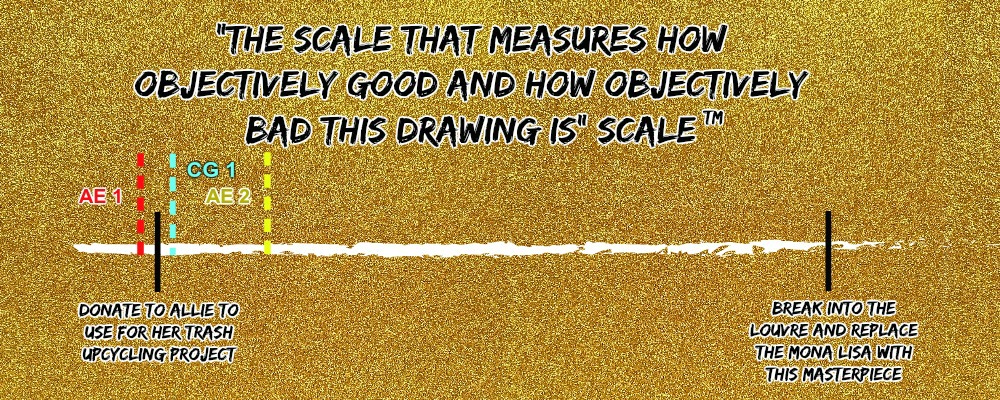
And I did, kind of, forget about my scale--ahem, sorry, the "The Scale that Measures How Objectively Good and How Objectively Bad This Drawing Is" Scale

Let me put my three final paintings on it:
Here they are for reference:
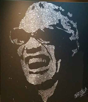
(From left to right) Albert Einstein, Allie, and McPerlman

I think the only reason why these paintings are so high is because the glitter effect is actually really cool. Even if glitter is evil and out to get me.

Oh wait, I almost forgot to rank my presentation as a true measure of my accomplishments.

Again. Totally objective.

What did I do right? You may ask? 
Well, I actually thought my intro, while not interesting, was kind of cute. I compiled clips from my friends' projects (thanks Krosky for making the group of all freshman more diverse) to kind of show a culminating little video for the Genius Project.


I also tried to make my powerpoint interesting, but I don't know how much I actually succeeded in that.


A Final Word: the irony is not lost on me that the main message of my presentation was: "When all you feel is disappointment, reflect on what's holding you back!", and I'm writing this right now, reflecting on the disappointment that was my presentation. But in all honesty, I'm glad for this project, because I was truly able to have fun with my project and my paintings. And I hope to become better at presenting and improvising! So, maybe messing up on stage was worth the lessons I learned? Tit for tat, I guess.

So an open letter to the Genius Project, because I just can't stop making this blog longer and longer:

Dear Genius Project,

Thank you for the blood, sweat, and tears! I truly mean it when I say you're probably one of the most difficult projects I've ever done, because of the personal walls and disappointment I had to face, as well as probably the most nerve-wracking, anxious presentation I've been daunted with to date. Looking back at all my blogs, I find it endearing to look at my little scribbles of drawings, and see what they've become throughout the weeks. I may have glitter stuck in my floors, on my clothes, in my mom's eye, and my dog's stomach, but I'm honest to god proud of what I accomplished. You may have been the most stressful project I've had thus far (I actually can't remember how stressed I was for the last two so I'm really just saying this just for dramatic effect), but you were probably my favorite. Don't tell Brain Project and Multiple Intelligence that though, you know how jealous they get.

Sincerest Regards of the Best,
Katie Lu


Time to burn all my terrible, terrible note cards and make a glitter painting of the ashes.

Citations:


Apr 7, 2019

Blog #5: T minus 3 Days!


We are how approaching the final Ted Talk so fast, I'm getting motion sickness (does anyone have a vomit bag?) Taking an assessment of my skills that I've acquired and built upon for the last six weeks, I can confirm that I can sorta do glitter painting! WoO! Just not glitter speed painting. So, that's a bummer. But I'm used to failures at this point.

I mean all my timelapses and paintings reached about 40-60 minutes each, so I already suspected that I wouldn't be able to paint anything in less than 5 minutes. I still called it glitter speed painting, though, because that sounds cooler and less lame. So, for the rest of this blog post, whenever I call something 'glitter speed painting' it's short (or long) for 'glitter painting'. 

Now that the Ted Talk is becoming much more real, and less like a nightmare that only appears in the deep, dark depths of my sleep, I'm realizing that I need to choose a focus, and fast. Because so far, my paintings have been based on paintings that other people have made: easily recognizable famous figures, like Marilyn Monroe, Princess Leia, and my subject, Albert Einstein.

I need to try something new, more geared towards to myself and my own interests, because Albert Einstein, even though we are birthday twins, I don't feel like I'm expressing any of my creative interests when I draw or paint him. But it still wouldn't hurt to put him on the canvases I bought.


Yikes. I mean, it's alright. But my test on regular-sized cardstock turned out much better... In my opinion.


What I did wrong:

1. In general, I think his face shape is wrong. Either it was wrong in the cardstock photo or it's wrong here on canvas. There's something about the new one that feels too round to me.

2. His hair is just everywhere. My brush strokes were too thick, and couldn't paint fine hair.

3. Eyes, nose, mouth and other features are not well defined. This is a problem with any glitter painting.

4. I think a major problem that contributes to a lot of issues was the fact the paint kept drying. This is a similar problem that I faced when I was working with Elmer's glue. So frustrating, because I would then forget whether the line I'd be painting was supposed to be painted or not. In a bunch of these, I'd go over the person's eyebrow without realizing, and then I'd have to wait for that spot to dry.

But regardless, it was time to do the fun paintings. I did Allie next. And the pressure was on, because if I screwed her portrait up, she'll actually see it...

Timelapses are some of the most exhausting things to edit. The files are way too large to just email or transfer via phone cord, so I always just use a little phone editor to speed the videos up before transferring using the cord. So here are a few photos that show how I first tested a drawing of Allie on plain printer paper:


Also Allie if I screwed up your face I am so sorry please do not kill me I tried my best.

I redrew it on my black canvas.
Kinda creepy.

The most annoying thing about these canvases is that eraser marks don't really go away, they just leave an annoying light mark on the canvas. So I did not drew random lines along Allie's cheeks, nor does she have a second eyebrow above her left one, it's the eraser. 


I gotta say, I'm the most proud of this one of all the ones I did today, because of maybe the sheer amount of glitter (gave kinda a cool effect), and it looks kind of like her? It looks way better in person by the way, if you're in morning block, you'll see it come presentation time.

But of course, there's still a bunch of stuff I lacked.

Namely:

1. Again, not clearly defined eyes, nose, mouth, and other features. I am sensing a theme.

2. Some little spots the glitter didn't stick to, makes the painting look a little weird.

3. Smile is just creepy. I have no idea how to fix that.

4. The hair line seems a little bit muddled, should make that more precise.

Alright, we're busting through these now! If you checked out blog #3, you would know I was trying a full body painting to push the envelope a little bit. This is definitely the worst one, because this style of painting does not fair well with a full body where there's a little of teeny tiny details. But I still tried it with a picture of McPerlman. 

Photo courtesy of... Actually I forgot who sent me this. But it's pure gold.

Of course, I wanted to portray the photo in art form, but that did not pan out as I had planned. I just did the outline of the figure, since trying to do all the little details would literally make me lose all grip of reality and complete my descent into madness.


I'm actually a little bit disheartened by the final results, I felt like I put a lot of effort into the sketch on printer paper (see the video), and it turned out pretty decent. But then the real one that I have to present just looks sloppy. 

What I did wrong (besides everything):

1. The lines are too inconsistent and sloppy. Some are really thick, way too thick, and others are too wavy. Others are too thin.

2. Mr. McDaniels's shoes are just barely shoes. They're like incomprehensible blobs.

3. Proportions are off, as usual. 

But overall, since these are my final products, they show my progress through the weeks, from a person who can barely draw to a person who can draw. Can said person make a good glitter speed painting? That's questionable.

But the homestretch is here now, it's only a matter of days until I'll be on that dreaded stage, face bright red, stuttering in a fluster of nerves, talking about glitter speed painting when it's actually just glitter painting. Can't. Wait.

Katie, you're so melodramatic.


Mar 24, 2019

Blog #4: The Vlog


So I'm writing this post as I'm trying to sweep glitter up into a dust pan. It is not going well, to say the least.

I guess that means that I finally did it! I graduated from pencil and paper and entered the realm of black paper, glue, and glitter. Was the end product just a blob of glitter or an actual tangible face? Watch to find out:


Disclaimer: The end-product looks super bad up close, but looks kind of good far away. Make of that what you will.

I am aware this video is pretty long, but I wanted to take you guys with me in the process of glitter painting as well as share my inspiration and resources (I already cut out a lot more than I wanted), so please bear with me and my short film.

I also thought it appropriate to end this entry with my new evil nemesis who is out to get me friend:


Mar 14, 2019

Blog #3: Uncharted Territory


There's been a slight change in plans. The original plan was to do my speed paints with just portraits that were from the neck-up. There's been a new development, however, and I've decided that I was going to try my hand at a full body painting. This presents some new challenges that I can identify right away, and the possibility for new potential problems.

Concern #1: It's going to be hard to make it look good.
All the examples that I've scoured the internet for have been strictly facial portraits:

(Exhibit A, B, & C)

The facial details that allow an audience to really identify and recognize the person being painted is one of the major components of glitter speed painting. And that scares me. I might have to make some adjustments, like a bigger canvas, finer tools, but first, I just want to jump headfirst into the water. If that water happens to be shark-infested or too shallow, or there's rocks at the bottom, I can just figure that out mid-flight.

But all jokes aside, I did want to expand beyond the limitations that glitter speed painting usually has. I want to try something, not only new to me, but maybe new to everyone. And I've also found a reference photo that I just cannot pass up, so I decided to try my hand at it, and if it fails miserably les misérably?, then I'll backtrack and go with plan B.

Have I come up with a plan B yet? Unclear.

Concern #2: This sets my schedule back a bit.
Now, I am very aware that me adding a whole new concept to learn this late in the game is dangerous, needless to say. But, I think it might be totally worth it. And what's the harm in taking risks in the biggest, most important project of the marking period that relies solely on my planning and time management skills?

Looking back now to blog #1, my timeline is more of one week of concentrated learning, and then the rest are just practice, practice, practice! So, I think I can afford to lose one week of maybe much needed practice and try this out.


Now that I've got these concerns said and documented (so I can look back later and realize they were all correct and I've indeed shot myself in the foot), it's time to learn how to sketch the full body.

Like last week, it's time for a control. But no science experiment this time (I've had enough of that). This time, I'm using a random reference photo that I'm not going to be considering for the actual project. The photo I want to use has more complex poses and body maneuvers, so I'm starting with just a basic pose. The place to find that is stock images:


You see, this isn't what I want. Far too intricate, and to be honest, I don't think anything I could draw could live up to the pure artistry of the photo. 


And I just wanted to mention that when I pulled this photo from google images, the title of it was "cool guy". Cool guy indeed. 


I'm going with this guy! He seems nice enough.

Also, when I saved the image above, the file name--the file name was very weirdly specific?
vvv
This isn't even important to my blog, I just wanted to share the bizarre thing I came across.

Now that I've chosen my reference photo, the one with a very specific file name, it was time to begin drawing the control. I drew a sketch of the photo before I actually learned anything...and the results were questionable, but had the potential for redemption the path to redemption.


Like I said, has merit, but needs much improvement. So let's put it on my objective scale! My second opinion isn't available this week, she had her own blog to do.

CG 1 stands for "Cool Guy 1".

I have not asked Allie if she would take this drawing yet, but I'm going to presume that she would appreciate it. However, I think it is a far cry from the second Albert Einstein portrait I drew last week, which I do say, I'm moderately proud of.

Now this sketch, I'm not proud of. So to improve, here are my biggest grievances with the sketch that I'm going to work on: 


Summing these up into this week's goals, we have:

Today, I focused on the simplified full-body human figure. In the video below, I draw the main sketch, as well as an example of what it looks like when the sketch goes wrong.


I wanted to preface that I have like two or more sketches that didn't quite pan out, just like the last one in the video. Like this one:

But not to worry! Because I got it right, and it was time to move on to drawing the actual reference photo again.


I think that my proportions definitely improved, and I got the general silhouette of him down.

And on my scale, I've placed it here:


While it's proportional, the details don't make it super distinctive, so it's chilling here.

Since I won't be painting people that just stare straight-ahead in a coffin, I need to work on poses. Of the beginner lessons I found, the foundations for drawing different poses feature more of just tips for different categories of poses. But in general, the idea is to sketch out the pose with the same lines and circles at the joints that the full-body figure has. The sketch should also maintain balance, with the center of gravity and center of support aligned in a vertical line.


The points at which the feet (or whatever limb is being balanced on) touches the ground form a line. The midpoint of that line is the center of support.

The center of gravity is behind the belly button, and those two points should be aligned on top of each other so a vertical line can go through them.


It's not just a line they can form either, since she is supporting her weight on her feet and one of her hands, it forms a triangle, and the center point of that triangle serves as her center of support.

The center of support also tends to lean to the side that the most weight is being put on.

The is an over-simplification of the idea, but it's a good starting point to drawing out poses.


I decided to try my hand at the running pose and a pose from a reference photo of my choice:

(Excuse the watermark, I don't know who invited her.)

And I have to say, I'm actually really proud of the sketches I ended up making:

(some issues on YouTube, comment if there are still issues here)

I'm really happy with the end products. They're definitely nowhere near Louvre material, but since I've always struggled with proportions and drawing, the dancing one especially makes me feel like I've actually made some decent progress!

Again, a completely objective scale.

Drawing really isn't as hard as I first thought. It just takes a couple tries to work out the kinks (like that strangely alien looking person), and then it goes alright. In the weeks to come, I'd like to learn the creative, artistic side of making portraits, and get to GLITTER. It's time to lay tarp over every inch of my entire house.

Hope to see you back when I update on the very very messy antics to come.

Research Links:


Mar 6, 2019

Blog #2: It's Not Rocket Science (maybe)


According to Einstein, "Failure is success in progress.", and as annoyingly cheesy as that sounds, who knows? Maybe the 160-IQ Nobel Laureate has a point.


Because what better way to kick off my first portrait of the Genius Project by drawing an actual genius!

In the spirit of my subject this week, Albert Einstein, I am conducting an infallible scientifically scientific science experiment* to see how my drawing skill set improves after actually learning how to draw. But first, I need a hypothesis.
*Not infallible, scientifically scientific, or science. Sorry Mr. Einstein.

Hypothesis: If I learn more about portrait drawing, then I'll get better at portrait drawing! (Results are shocking!)

Like any infallible scientifically scientific science experiment, I need a control. I drew Einstein with no prior knowledge, technique, or any clue how to draw him, just based off of the reference photo. Then, I rated it on the "The Scale That Measures How Objectively** Good and How Objectively** Bad This Drawing Is" Scale™.
**Not objective. Like at all. In fact it's literally the most subjective way to evaluate this.


For more input, I am also including a questionnaire to help evaluate the drawing's position on the spectrum. To make sure everything is completely objective (still not objective at all), I asked for a second opinion.

1. Does it resemble my subject even the slightest bit?
Second Opinion: I mean.... I guess

2. Are the proportions accurate and realistic?
Second Opinion: I'm pretty sure Einstein had a big forehead but other than that...I can tell it's a mammal...

3. How close does it match the reference photo?
Second Opinion: Better than I can do.

4. Would you buy it if sold?
Second Opinion: I think you should pay me for my eye doctor bill.


Wow that's kind of harsh, Second Opinion. But taking everything in to account, let's see what our results are:


I tried asking her. She wouldn't take it.

After the evaluation, my portrait, from what we can all obviously see, struggles quite a bit in the proportion arena, so what I'm looking for this week is a full understanding of the proportions of the standard human face. I will first be learning how to draw a simplified version of it, which I can then build off of. Since most people's features aren't perfectly symmetrical or perfectly aligned and proportional, I'm also looking to be able to adjust these proportions to an image of a real person. 

In particular, the jaw of my Einstein has many weird and off peculiarities. It really has no shape beyond the two-dimensional plane and looks nothing like his actual jaw, so I'll be concentrating on the proportions of the jaw, especially, along with the rest of the face.

Now, the hair of my Einstein is also pretty laughable (ramen noodles?) but I don't think I'll be prioritizing hair and the physics of hair, since glitter speed painting doesn't really entail drawing in any extreme detail.

So to reiterate, my goals are to:

Now let's go back to science experiment. My independent variable: learning how to actually draw a portrait.

Now, knowledge (wow!) leads me to believe that the classic techniques for portrait drawing starts with a vertical line down the center, a horizontal middle line, a hairline, etc. But to be frank, I always thought of it as a huge waste of time (not that I have better things to do). Why do that when you can do it by eye?

Here's a hint: This is why.

After intensely viewing and taking notes on these videos from various channels, I now have several pages about the Loomis Method, named after the famous technique by Andrew Loomis in his book "Drawing the Head & Hands". This method of portrait drawing deconstructs the head into the cranium and the jaw, using guidelines (like the vertical and horizontal lines) to proportion the features of the face. These videos tutorial how to draw the simplified version of the human head, and it was the best place to start building the fundamentals.


So let's break the Loomis Method down:

1. Draw a circle to represent the cranium of the head.

    • As I previously mentioned, the Loomis Method deconstructs the human head into the cranium and the jaw, the cranium being circular and the jaw being more of a boxy wedge shape.
    • We draw the cranium first because the Loomis Method depicts the jaw as more of an attachment to the cranium, which acts as the base for the entire face.


2. Drawing the center and browlines.

    • The key for maintaining proportions in the Loomis Method is drawing lines for each of the features at different distances. We begin this by drawing the center line going down vertically, and the browline, which goes across horizontally.


3. Draw the hairline, the line at the bottom of the nose, and the chin
    • The hairline is 2/3 of the way up from the nose
    • The bottom of the nose ends 2/3 away from the browline


4. Adjust the head shape based on the angle

    • Most people' faces aren't rounded, they are more of an oval
    • The inner curves trimming down the circle
    • It was during research on this step when I found out the slew of people's different face shapes, jaws, eye shapes, which all have different names. Kind of makes me wonder why there's a standard human face shape at all.


5. Attach jaw and touch up rest of sketch.
    • Draw the jaw from the bottom curve of the cranium. The jaw goes out, then tapers off to meet the chin
    • Connect the curves on the sides of the face with the chin
    • Draw in the neck and shoulde.r
    • And you're done!
    • Note the rule of thirds: a general guideline that the hairline to the brow-line, the brow-line to the bottom of the nose, and the bottom of the nose to the chin all have equal increments of space between them.


These are first baby steps to the Loomis Method, and I continued with learning about where to place face features, positioning due to angles, and how to adjust this sketch to any photo. After all my research, I redid my Albert Einstein sketch to test the results:


Personally, I think it's a HUGE difference from before. The proportions, while not perfect, look right, jaw looks more like the image, the nose even looks better. I even did a better job at the hair, which I was not trying to learn this week. It still has a long way to go, but let's put it on the scale.


And if we go back to our "experiment", I can confirm that when you learn about portrait-drawing, you get better at portrait drawing.

I think it's safe to say, I reached all my goals for Week 2!
That's enough science for one day.